Look Like Coffee: A Modern Display Font for Digital Branding
It started with a hero section—clean layout, soft gradient background, and a headline that just wasn’t landing. I’d tried three fonts already: one too corporate, one too delicate, one too generic. Then I dropped Look Like Coffee into the headline field, adjusted the tracking by 20 units, and paused. The tone shifted instantly—not louder, but *clearer*. Warmer. More intentional. That’s when I knew this wasn’t just another display font; it was a quiet upgrade to how digital spaces communicate feeling before function.
What It Feels Like in Real Layouts
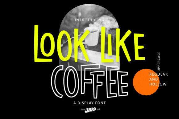
Look Like Coffee is a modern display font with subtle geometric confidence and a relaxed rhythm. Its letterforms balance clean lines with gentle curves—notice the open counters in “a” and “e”, the friendly tilt of the lowercase “t”, the grounded weight of capitals without heaviness. It doesn’t shout. It invites. On a boutique coaching site, it turned “You Belong Here” from polite to personal. On a product landing page, “Simple. Thoughtful. Yours.” gained quiet authority. This isn’t a font for body copy or navigation menus—it’s built for moments where typography carries emotional weight: headlines, section titles, call-to-action buttons, and branded graphic elements.
How It Performs Across Devices and Contexts
I tested Look Like Coffee across real scenarios: mobile viewports, dark-mode previews, image overlays, and fast-loading hero sections. At 48px on desktop, it’s effortlessly legible—even over textured backgrounds. At 32px on mobile, it holds its shape well, though I recommend avoiding it below 24px unless used decoratively (e.g., a small tagline beneath a logo). Its PUA encoding ensures consistent glyph access across platforms, which mattered when exporting SVG icons and previewing in Figma’s web export mode. I also checked contrast ratios: against light backgrounds, it meets WCAG AA at headline sizes; against dark or busy images, I added a subtle text shadow or light overlay—simple fixes that preserved its warmth without sacrificing accessibility.
Where It Shines—and Where to Step Back
This font thrives in high-impact, low-density contexts. On a course sales page, it transformed the main headline and “Enroll Now” button—making the offer feel both aspirational and approachable. In a portfolio site’s project grid, it gave each case study title distinct personality without competing with imagery. For a digital brand kit, it paired beautifully with a neutral sans serif (like Inter or Manrope) for body text—creating clear visual hierarchy and editorial polish. But I wouldn’t use Look Like Coffee for form labels, footer links, or dense dashboard headers. Its charm lives in brevity: short phrases, names, titles, and decorative accents—not paragraphs or functional UI text. If your site relies heavily on readability-critical components (think pricing tables or FAQ accordions), keep it reserved for top-of-funnel moments.
Smart Pairing for Cohesive Digital Identity
Display fonts like Look Like Coffee don’t live in isolation—they’re anchors in a typographic system. I paired it with Inter (variable weight) for all body copy, using its optical sizing features to maintain harmony across breakpoints. For a more editorial feel—say, on a blog redesign—I swapped in a warm, low-contrast serif like Literata for article titles, letting Look Like Coffee handle only the most prominent branding moments (logo lockup, newsletter banner, social preview graphics). The key is contrast with purpose: let the display font set the mood, and let the supporting typeface support understanding. No need for ornate scripts or clashing serifs—clarity and consistency win every time.
Practical Notes Before You Implement
Before adding Look Like Coffee to a live site or client project, check what’s included: webfont formats (WOFF2 is essential for performance), available weights (I used Regular and Bold most often), and whether stylistic alternates or ligatures are accessible via CSS font-feature-settings. Licensing is straightforward—it’s a commercial font, so you’re covered for client sites, SaaS dashboards, and online stores as long as you’ve purchased a valid license. No surprises there. And while it supports English and common Western European characters out of the box, verify multilingual needs early if your audience spans broader language sets. Finally, always test loading behavior: self-hosted webfonts with `font-display: swap` kept my LCP scores healthy, and the font’s modest file size meant no perceptible delay—even on slower connections.
At its best, Look Like Coffee doesn’t draw attention to itself. It draws attention to *your message*. It’s the kind of display font that makes visitors pause—not because it’s flashy, but because it feels like it belongs. Like the first sip of something familiar, made fresh again. Whether you're refining a portfolio, launching a course, or rebranding a small business website, this font quietly lifts the whole experience. Not with noise—but with nuance.